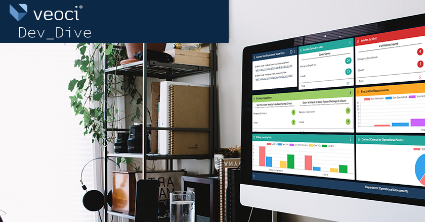
So here we are, two and a half years after I originally penned my thoughts on rebuilding Veoci using Vue and Vuetify; much has changed. After the celebration of Veoci’s 10th birthday earlier this year, I decided this was an appropriate time to pause and reflect.
We have come so very far, and the new Veoci interface, which we internally call Veoci New, is one of our collective crowning achievements. Veoci, as a company, is an exceptional group of people working lockstep across team boundaries; as a team, we’ve completed a daunting challenge other teams often struggle through.
The New Veoci Interface has roots as an engineering “greenfield project” – an initiative that is not constrained by the work already done in the previous interface, which we call “Veoci Classic.” Due to its scope, in a lot of ways it has become the defining project of our recent history.
Why Veoci New?
In the project’s early days of abundant excitement and optimism, many members of the engineering team thought migrating our front end to VueJS and Vuetify would serve as a “silver bullet” to many of the challenges our engineering teams face. In many ways, it truly was a marvelous improvement to the development process. From the instant gratification of hot reloading in code changes, to the ease of architecting complex UI interactions using Vue components and the Vuex store, developer satisfaction was, and still is, at an all-time high. In addition to the technical goals we sought to achieve, we also kept a focus on Veoci’s goal to help communities and organizations improve their preparedness and resilience.
Veoci is an incredibly powerful and flexible platform with almost limitless customization. Throughout the project, we needed to identify all of the edge case features to ensure the new interface still served uncommon configurations. Capturing all of these different configurations while deep in development proved to be a significant challenge. However, with the help of Veoci’s top notch QA team, a robust A-B testing process took shape to help identify those areas that were missing some edge case handling.
One of the other goals of this project was to scaffold out an internal UX (user experience) framework to facilitate a common terminology across business functions and the various solutions our customers use. By standardizing our communication methods we were able to pull many of the obscure and low-use features into the framework, which helped the team make these lower-use features easy to find and utilize for users.
We also introduced a consistent UI and UX workflow for any proposed changes. This review process helps the development team ensure the interface maintains its ease of use. This will allow us to ensure that Veoci continues to be exceptionally user friendly, while still giving users the power and control they want.
The new development tooling introduced by the Veoci New project has allowed the development team to spend more time improving Veoci in ways that were previously unimaginable. Requests that formerly caused migraines are now very much in the realm of possibility. For instance, we were able to fulfill a request for “real time reactions” to messages that would have been technically challenging in Veoci Classic, but was smooth and streamlined in the New Veoci.
Continuous Innovation
This project, from the outset, was always more than just updating the interface. We spelled out concrete goals with results ready to launch alongside the new interface.
First, we know we want to achieve full WCAG AA accessibility compliance. Veoci is an inclusive tool and we strive to make sure that we provide the best experience possible for individuals using assistive technology. However, just getting WCAG AA approval was not sufficient for our team. We want to continue ensuring our high standards are met, so the QA team has been working tirelessly to write some automated test scripts that are executed through the axe accessibility tester. These tests are executed daily with results delivered to the development team to review and resolve accessibility concerns before they can be introduced into production.
The second major goal was achieving full i18n internationalization. Right out of the gate we set up a framework for ensuring all the text in the application was ready to be translated. This allows us to expand our language set as customer needs arise. Moving forward, this new standard is a core part of our code review process.
Applying Creativity
We took away some important technical lessons from this project, ones we can pass onto other teams working with VueJS framework.
Roughly midway through the project, we opened a “production” test environment for early internal users, who started to report hanging pages. Several incremental deep dives into the Chrome performance profiler led us to the culprit. At this point in the project we were making heavy use of the Vuex store, which involved loading extremely large blobs of data from the server and depositing them in the store. A specific example: different views in Veoci loading in a list of forms the user has access to.
Most of the time, this would be a reasonable list that the store had no problem handling. However, once we started examining some real test cases, we discovered an interesting trend; many solutions used by our customers had specific configurations that would either load hundreds of forms or forms with hundreds to thousands of discrete fields. Loading and storing this data was clearly impacting our store performance.
Our incredible Front End team got to work thinking outside the box how to solve that problem. We realized that the store was a new and novel technology, but could be a hindrance if used incorrectly. To get technical, we discovered that internally Vuex was “deep copying” every data point currently stored across the store modules. With normalized and flattened data, this was not a problem. Forms that contain fields and as many as 10 layers of nested properties and data, however, were causing the slowdown.
Solving this problem took a few clever solutions. We started from the backend and came up with a new set of APIs that would only return flattened form data when they fetched the list of forms. This alone made a substantial difference on client performance. We knew there was some room to further improve the client, though; the “deep copy” was still happening.
Enter Object.freeze(). This is a relatively new construct in Javascript that allows you to prevent any changes from happening to your object. We attempted to implement this, but it didn’t quite solve the problem totally. Just because an object is “frozen” doesn’t mean that Vuex won’t do the “deep copy” with each mutation. Deep copying doesn’t cause the object to be “changed,” so Object.freeze() didn’t help much. This led us to an incredibly effective — and unconventional — strategy. Ultimately, we decided to try to “stringify” the data set before inserting it into the store.
This method effectively flattens a data set to a single level, the string, which prevents any of the bindings to be configured, except on the top level of the string. Now, parsing and stringifying does present some additional overhead but it was such a minor hit that we feel it is worth the tradeoff for the gains we’ve seen. As a result of this hard work, loading and interacting with the list of forms in Veoci New is snappy and performant.
Holistic Improvement
Everything that I’ve discussed so far has really been around the Front End Team’s efforts for the Veoci New project. But the Backend team, of course, has played a role in this as well.
Early stages of the Veoci New project, we identified our own API as an opportunity area for us to grow and expand Veoci as a platform. The new interface provided us the amazing chance to leverage the new version of our API, AKA Veoci API v2, as the first “customer.” The Dev Team put our heads together and began compiling a list of “pie in the sky” features we wanted our API to accomplish and then we set out to build them. With these API changes the Veoci New project was able to really take off.
While this was ongoing, the client team set out to create a “VeociJS” library which would streamline the Veoci API v2 usage in external applications. This is a semantic JS library similar to how Firebase structures their JS library to make its usage extremely straightforward. The library packages up all the authentication mechanisms and allows developers to quickly latch onto the Veoci backend. The Veoci New project is the first “external customer” of this library, with the forthcoming New Veoci Mobile application being the second. We have some big plans for this library and are excited to watch it grow!
Frameworks and the Future
You may have noticed a prevailing theme throughout: the idea of creating frameworks. Whether it is a framework for UI/UX changes or a framework for handling internationalization, we determined it was critical to put some guidelines in place to ensure Veoci maintains its quality as it grows.
Everything is built on a foundation; this project was not only about modernizing and streamlining the interface of Veoci, but optimizing and strengthening the platform’s foundation for the future. Veoci New is the first of many steps in our plans to continue innovating, and provides us with an even stronger and capable foundation for achieving those goals.
We’re excited to continue growing and see how the enhancements we deliver positively impact our customers and their operations. As we continue to innovate and implement new and exciting features, make sure to check back here to learn more about how those enhancements can serve and bolster existing solutions.


